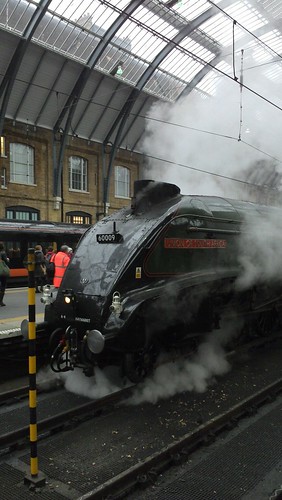
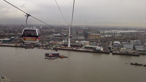
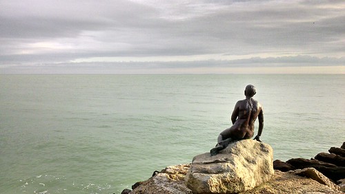
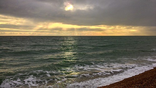
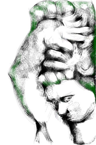
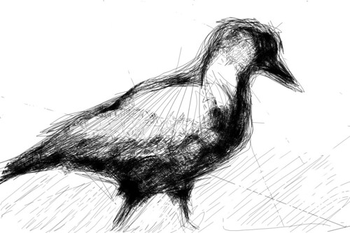
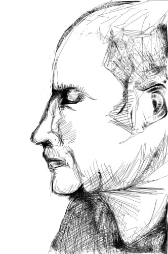
I haven't done much drawing in a while - it's getting too cold for casual outdoor sketching and I have had less time to attend life drawing classes. I still take photos though:


The poetry course will be over in a day, so I decided to share my last essay I sent there a week ago.
The task was to write a "random" poem using the method of mesostic and an automated script, and then to do a close reading of it and to express thoughts on the technique used.
There were actually two tasks to choose from with the remaining one being playing with Bernadette Mayer's methods, but I made my decision very quickly for the reasons explained below.
***I can't resist starting with an explanation of my choice between the two options available for this assignment. It was easier for me than I expected to make this decision when I realised that despite its "technical" feel the "mesostic" method is actually not very different from some tactics we were already introduced to (Tristan Tzara's "How to make a Dadaist poem" being the most obvious example). This recurrence was the first thing to catch my eye and it didn't allow me to dismiss this option thoughtlessly as a curious but (at first glance) not deep enough experiment.
Then the fact John Cage was a composer and his idea of words being liberated from the "forced" meanings to become sort of as musical samples simply left me no other choice. Not being an English native speaker this is exactly how I used and sometimes still do perceive English lyrics in songs when vocals aren't very distinctive, and the strange thing is that it doesn't immediately make them dull or unworthy - they remain quite enjoyable, only in a different way. So due to my weakness I have a privilege to know for sure that the result I received from the automated script wasn't just a chaotic nonsense:
          What
         hAve
          Looking
         aT

          Whole
families sHopping
         aIsles
          The avocados
         aMong
  refrigerAtor
      eyeiNg
I chose WALT WHITMAN as a "spine" for my poem because from the very beginning of the course I was definitely more attracted to Whitmanian bunch. I believe by the way that this first step is very important in mesostic as it is the only part of the process which is entirely up to the creator. While pointing the script to source text is also a conscious decision, there is no control on what exactly would make it into the final poem. While you're free to choose between the undoubtedly different sources - different epochs, schools, genres, authors - it is still possible that the final difference would be next to none if the same words are picked out. Same words taken out of their natural context, much as fish taken out of the water, immediately become the same and lose the name of action.
So it is the "spine" that grants them a new life and essentially defines the new context – or more precisely, you do by choosing that "axis". The whole process of the creation packed in a single concentrated effort - when you accept this idea it suddenly becomes difficult to shout out a "random" name. What could've been easier than that before you became aware of the trick?
I used "A Supermarket in California" as a source because of its direct connection to the spine ("Where are we going, Walt Whitman?") It might be a wrong thing to abuse the randomness in that way but in my opinion it is justified by the created opportunity of receiving an answer to the questions asked in the poem.
I'm satisfied with the result which by the way was the first combination I received. If reviewed as a "foreign song" merely by how words sound it's proportionally weighted with the first shorter stanza composed of shorter words than the longer second one. It also starts with "what" which rhymes with "Walt" creating an intricate connection between the first horizontal and the first vertical words.
In the second stanza I like how the word "shopping" connects the two lines there, being shared between the "families shopping" and "shopping aisles", equally forming two meaningful combinations. There is also meta meaning in it as it is shopping as a process, not as a word, that leads people to aisles in real life.
The geometry of the poem is also nice: not too symmetrical but also not shaky with the counterpoising balanced beams of "families" and "avocados". Poem's "body" has a non-trivial shape resembling a comma, straight for most of its length but curving left at the end. Again an odd meta feeling here: with not a single comma in the whole poem it's still basically a list of independent words, each of them could be followed by one - so forming together a giant comma, they unexpectedly make sense.
But arguably the main purpose of any poem like this is to provoke thoughts on the context defined the spine phrase or name, to shed some light from an unusual angle and to admire the fanciful shadows it forms. Well, it did make me think of Walt Whitman, his poetry and his followers like Allen Ginsberg lost in the supermarket. It wasn't a single distinctive and clear idea, or I’d say not a problem which became clear to me. It was rather lots of unshaped thoughts and emotions, quick associations appearing instantly to burst into new ones like fireworks - bright, enjoyable and unstable.
Much like what I feel when I listen to music, only this time that was a music of "raw" words, instruments for which I have chosen for the band of the mesostic myself.
I'm taking an American poetry course with Coursera the main part of which is writing essays. It's been quite a while since I did anything like that, and needless to say back in the day essays used to come in Russian, so my first results were as miserable as you could expect. They probably still are, but the last week's essay was finally the one I'm not that ashamed to share.
So the task was to compare two versions of William Carlos Williams's "Young Woman at a Window" (1, 2) and decide which one looks "more imagist" and why.
***
"The song sings itself"
According to a famous apocryphal story Michelangelo was once asked how did he know what to cut away. The response was, "It's simple. I just remove everything that doesn't look like David."
Much like Michelangelo's work, the second version of the poem looks like it was stripped of everything that wasn't very necessary to shape the idea. Pretty much everything representing a logical consequence of something already stated has been cut out. As a result, every new line of that version adds something new to the picture which did exist before instead of simply clarifying or detailing presented the previous stanzas. "Nor the merely decorative word".
This becomes clear when two versions are compared line by line. "She sits there" - where else can she sit? What changes if the woman sits "here" and not "there"? Sorry, but "there" has to leave. "While" - not needed, this poem is snapping a moment like a camera, so of course it's "while", no need to state it literally, goodbye and thank you.
Although these were the easy bits and it gets more complicated later. "The child who robs her knows nothing of his theft" - the whole point is gone in the second version, so this time it is not only about removing some obstructive words, this is a complete message being removed. That seems like an important edit yet it doesn't make a new poem, it stays under the same title - that probably means it's still the same and the cut wasn't damaging to the global idea.
This is where another imagism manifesto point comes to mind, particularly "to represent an image" one. From the image poem creates, reader is supposed to get the fact the child changes ("robs") woman's life of something on his or her own. Should it be stated directly, it'd give reader the idea straight away "robbing" them of their own impressions and intellectual work. Everything else in the poem would become nothing more than a frame for that literal statement rendering most of it once again unnecessary.
When the message is removed, all left is an image of a woman crying, holding a child who is interested in something else, "his nose pressed to the glass". He is not focused on the woman at the moment while she has him on her lap and obviously can't ignore him even being extremely disappointed. She is robbed by child having to care about him without receiving much back yet.
The same message is still delivered, only in a gentle way.
The manifesto also defines imagism as something "hard and clear, never blurred nor indefinite." This fits the vision again. While the reader is invited to make their own conclusions, the picture created by the second version of the poem remains crisp. All the major words are nouns with very particular meaning in a focused context: "cheer", "tears", "lap", "child", "nose", "glass". Metaforical interpretation is hardly possible here - the "woman" is the woman and the "child" is the kid, they aren't, say, Nature and Humanity, such a comparison seems very artificial and non-applicable.
Everything is kept simple and the image is clear.
Here is a woman in tears. Her child doesn't hear her.
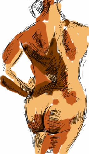
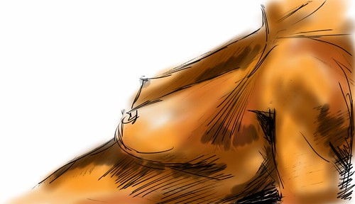
I started with the same simple app I used last time and then switched to Autodesk Sketchbook which is much more powerful and feature-rich. While screen size and stylus precision remain natural limitations of this medium, now I feel like it's my own skill (or more correctly lack of it) that restricts me, far from being capped by application possibilities. Fun.


There was another person with a tablet in the class today - first I though that was iPad, but the screen was even bigger. When I took a closer look later it turned out to be a tablet PC running ordinary Windows and Photoshop. Apparently it was also pressure-sensitive making it an ultimate drawing machine.
I tried to sketch on my phone before, but that my first attempt to draw on a tablet with bigger screen. I was better than I expected, but the application which was the best one to use with phone turned out to be less convenient with more screen real estate available. The worst was the lack of adjustments for brush size, and I also realised soon that the style of drawings was defined more by the application than by myself.
It's definitely worth giving it another go with a better app. Any suggestions?

HMS Ocean, current Royal Navy's biggest ship is the obvious symbol of excessive military presence in Olympic London. She is serving as helicopter base and barracks for troops and thus usually remains closed to public, but today civilians were let on board for the second time since she had arrived. I wasn't a fan of that security frenzy and still think it was at the very least questionable decision to militarise the event, but it's always interesting to get a look at such a great piece of engineering.
Possibly the pause between Olympics and Paralympics is to blame, but there was almost no queue so it was only needed to wait for the ferry boat to get there. Like at HMS St Albans two years ago, only limited spaces were open, but still it was quite possible to learn something new.
When looking from the distance, I thought those niches in ship's sides are closed with some cover not visible from there when it's not moored. It turned out they're "permanent" housing landing crafts on their cranes (davits):
The font used in various writings is more strict than on HMS St Albans, but resembles pub menu a bit. I actually like it, it's just surprising to read something like "Danger! Explosives!" in careful curlicues:
Some internal warnings (guess nothing secret):
Hangar deck with a "folded" Lynx helicopter and some other vehicles:
Helicopters are brought to the flight deck from there by two lifts like this:
The flight deck has not ski-jump deck and thus is suitable only for helicopters and jump jets:
Since Harriers are now retired, the only option are helicopters. Same is true for older HMS Illustrious which while boasting a ramp, still cannot operate fixed wing aircraft. New "true" aircraft carrier is only expected by 2020 and meanwhile there were thoughts to share one with France. Later rejected, they still did spark inevitable jokes like "what shall we do when French half surrenders?"
Ground connection on the flight deck:
The ship is quite tall as well - taller than great deal of houses in London:
Finally, a video from the ferry boat showing HMS Ocean from all sides, and a link to the corresponding Flickr set:
While often dubbed "Angel's shabby twin", Holloway Road (which I now cycle along almost every day since we moved) still offers plenty of interesting details to rest your eyes on if you only bother to look above the ground floor shops.
What I noticed only after about a month, on a relatively short length from Nag's Head to Highbury Corner roundabout there are four buildings featuring clocks on them.
The first one (if we're walking southwards) would be the building next to the Waitrose store bordering The Coronet, the former Art Deco cinema opened as Savoy during the WWII and now an inexpensive Wetherspoon pub:
Green clock face, golden hands, and accurate enough - what else to wish for? Also, the architectural details - aren't they looking good?
The last film shown at The Coronet when it still was a cinema was Blade Runner, a sequel of which is expected soon (finger crossed it won't be what Prometheus was to Alien).
The next clock down the street isn't a part of some ensemble and is more simple, as is the building itself. But unlike its neighbour there are two clock faces making it visible not only from across the road, but from the adjacent pavement as well. Sadly, they both seem to be broken (hopefully not for too long):
Then one of the London Metropolitan University buildings (particularly The Rocket Complex) also features a small clocktower on top:
The university formerly known as the University of North London is not amongst the valued ones and the reviews I've seen were average at best. But what we're interested in now is the clock. Readable from either side, this clock works and reads accurate time:
What is also interesting about this area is the university buildings standing next to each other but built in a very different architectural style: black concrete tower which would have surely delighted Brezhnev, stainless steel irregular deconstructivist Graduate Centre, glass cubes of office block appearance, The Rocket Complex mentioned above, and more.
The development continues - it was announced recently 12-storey student accommodation block will be erected across the road, once again not rhyming its style with other buildings on that junction.
The last one is the clocktower of St Mary Magdalen's church surrounded by a small garden but still clearly visible from the Holloway Road. This is the only set of clocks on the southern side of the road as the previous ones are all on the northern one:
And it's not the end of it as we have only walked for 20 minutes or so, and only in one direction. But then Highbury starts which is quite a different story.
The major clocktower of the area by the way is to the south from there beyond Caledonian Road. Good news of the week is that its clock has also been restored.
From Bloody Foreigners by Robert Winder:
"Amelie Struve [...] also tried to raise charitable relief [for poor German workers in Britain], but was turned down by the Mayor of London [...] She was also opposed by Marx and Engels, who wrote a letter to The Times denouncing such charity on the grounds that it would give more useful exiles (such as themselves) a bad name"
If you google that, this book will be the only source, but still the letter itself could be found: http://www.marxists.org/archive/marx/works/1850/05/28.htm
Impressive to say the least.
July 28th: A stunning ceremony opened the Games: http://www.bbc.co.uk/sport/0/olympics/18906710 At the very same time, more than a hundred cyclists kettled by police near the Olympic park for attending the monthly group ride event: http://www.bbc.co.uk/news/uk-england-london-19023104
August 1st: Bradley Wiggins wins a gold for Team GB: http://www.bbc.co.uk/sport/0/olympics/19077813 Later the same day cyclist is killed by Olympic bus driver near the velodrome: http://www.bbc.co.uk/news/uk-england-19087826
This is probably the main reason I am not excited and didn't bother to get tickets even for sports I'm myself into.
P.S. "Bradley Wiggins reacts to Olympic park rape urging women to dress modestly" http://www.guardian.co.uk/sport/2012/aug/02/bradley-wiggins-law-cyclists-helmets Seems to be a mistake in report: https://twitter.com/bradwiggins/status/231017601193635840
While taking a shortcut to the cinema this weekend we have accidentally witnessed the Olympic torch being carried by:
There were two heavily modified vehicles preceding the torchbearer (I couldn't even tell if they were lorries or buses), ruthlessly branded and playing some loud music. Half of the flags, inflatable toys and other stuff people were using to express their impatience were branded as well. Little surprise here as the very Olympic rings are themselves a brand which you're only expected to consume, but not to use.
It might be a lame opinion out of touch with reality, but I find branding of the supposedly public events and elements of infrastructure like Barklays bikes or Emirates dangleway somewhat wrong. I can understand (and sometimes appreciate) excessive branding when you don't pay for the branded thing, but not when you're just paying less (or more precisely you're said you're paying much less). If you are still going to charge people, keeping messing with their heads is just cheeky.
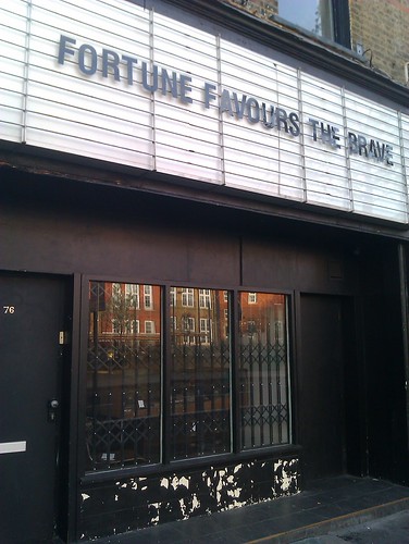
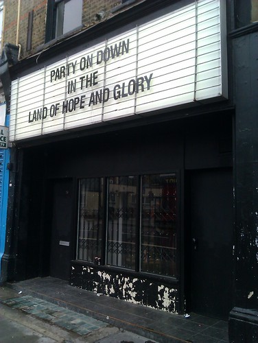
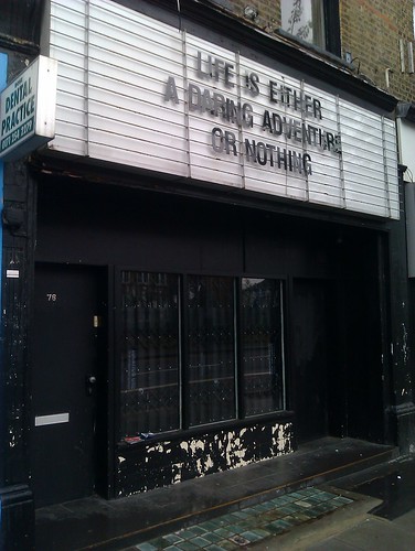
Some club on Stoke Newington Road has that cool sign to hang letters on like on the old cinema (or not actually as old - Rio Cinema in Dalston, ten minutes walk from there, still has it). I cycle to office daily down this road and get sometimes amused enough to stop and take a picture.
First day I noticed that (early April):
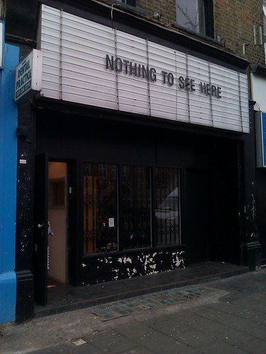
Later:
Diamond Jubilee:
Today:
Walking through the Covent Garden area today we have stumbled upon the recently iconic London couple, the ginger cat named Bob and his master James. Unexpectedly, what we have seen has made me sad - quite an opposite effect comparing to the same encounters two or three years ago when they still used to sell The Big Issue near the Angel Tube station.
The cat was still adorable and calm sporting another colourful scarf, but this time James wasn't selling anything. Sitting on the pavement, he was just repeatedly asking the people crowding around them "to make a donation if they were taking pictures".
There might be a thousand explanations (charity fundraising comes to mind, for instance) and I could easily be too ignorant to notice some important details, but still that almost made me cringe inside. You see, James and Bob are known all over London for their story of honesty and persistence rewarded. Fighting their way out of the street, not begging but working, boasting their distinctive personalities, winning the hearts of Londoners and finally securing a book deal!
Now there were two thing that disappointed me. The first and "the easy" one: well, apparently the book deal and popularity weren't enough to provide for them. That's harsh, but that's also something you can at least try to correct by contributing.
But the second and the most important reason was that this time the whole thing looked much more like an undisguised exploitation of the original idea. Of course the cat was there first to boost sales and not just to cheer the public up (not a problem at all with that) - but today there were even no sales, so the simple fact of taking advantage of the once earned public image became uneasily obvious. And that was done in the simplest possible way, by asking (or should I rather say begging?) for change in a crowded spot. I mean, that ruins the whole story, doesn't it?
That really shouldn't have ended like this, so I do hope I got it all wrong.
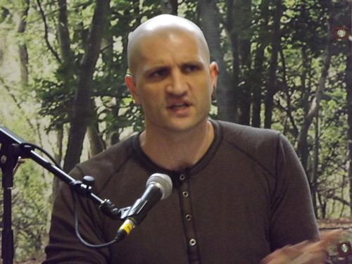
I couldn't find any verbose reports from this talk, so apparently I need to write down the points I liked most (although these are not the exact quotes, only as precise as I remember and reproduce them in my ESL):
The Shoal: "That old shopping centre in Stratford was made redundant by Westfield, so let's just hide it and pretend that's art" (also, the same point from diamond geezer)
The Orbit: "I actually liked the architecture first and then I learned that it's called ArcelorMittal Orbit, and that was an instant "no" for me. This changes everything. You know, we don't even have luxury to judge these objects as architecture because of that shameless branding".
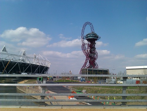
Gentrification: "I'm far from romanticising the gutter and welcome changes, but changes may come in different packages. It's like you're opposing your school to become an academy, and then you're suddenly "against putting more funds in the education". No, I am not, that's not what I said".
Moody's report: "There might be different opinions, but look, their job is make rich people even richer, and from what we see, they do it well - and they have made it clear: the Olympics aren't going to be economically beneficial".
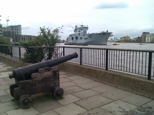
Westfield Stratford: "It is a sacred place, the only one that was secured by the Army during the last year riots. There are going to be more soldiers deployed in London during the Olympics than in Afganistan".
Sports: "...oh yes, sports! How could we forget".